Plotly vs Seaborn
Libraries
Both Seaborn and Plotly are nice charting libs in python
This comparison is my personal subjective view and reminder to myself of the nice features of each.
Datasets
Load a few popular datasets to use
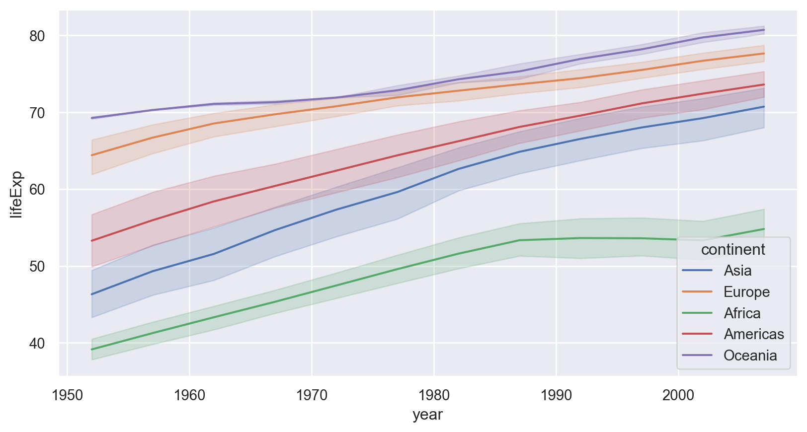
Line chart
- Plotly need to summarize the data before plotting
- Seaborn has built-in stats function and distribution allows plot a distribution in charts
Here is a plotly chart.
Here is a plotly chart.
Here is the seaborn chart.
A lot less code needed, and more features in the chart.
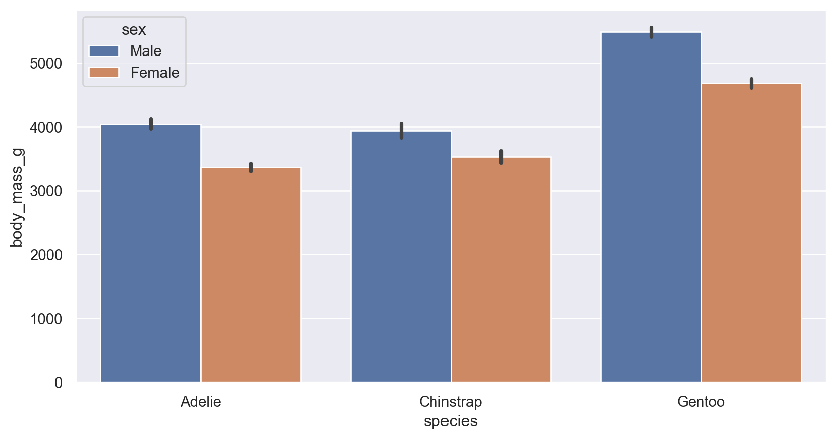
Bar chart
Seaborn bar plot
automatically shows a clustered bar with built-in stats for average and error bar, but creating a stacked bar seems difficult.
Seaborn bar plot
Plotly
It needs to manually compute stats and no error bar. but otherwise shows a clusters bar easily
Plotly
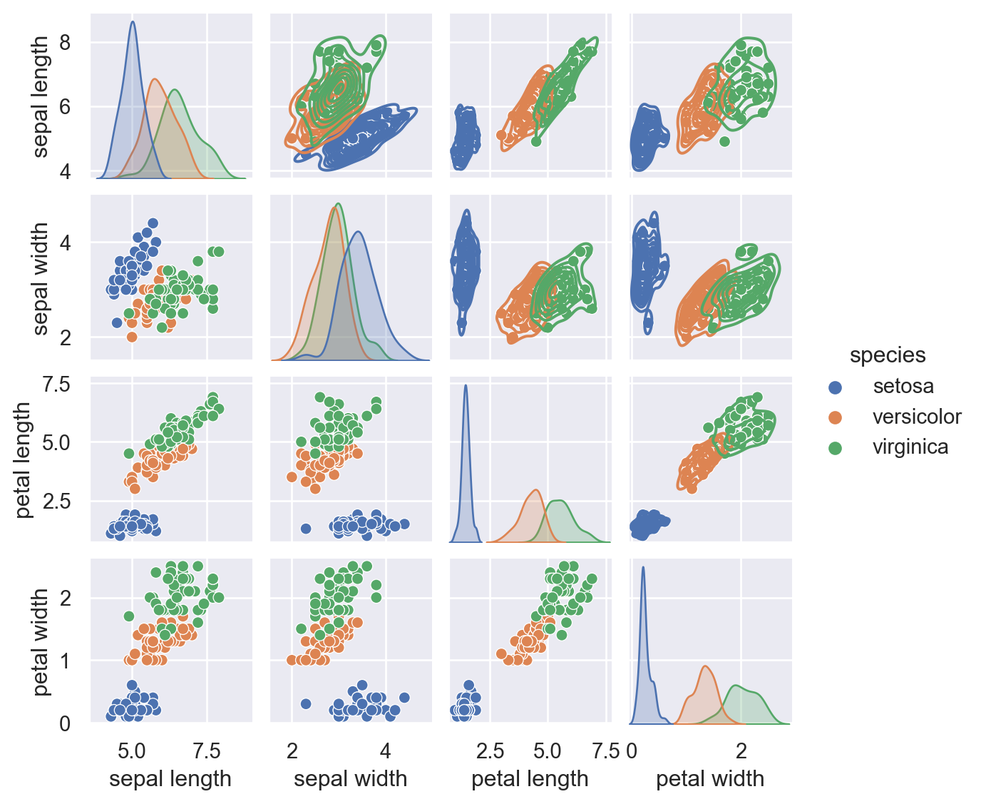
Pair plot
Seaborn
Built-in stats make the a lot better than plotly
Seaborn
Plotly
scatter matrix is scatter only.
Plotly
Plotly features
We already see the interactive nature. It also has nice type of charts like sunburst and geo plots
A sunburst chart
It shows hierarchy and hover info is very useful here.
A sunburst chart
A geo plot
Use iso_alpha codes and plot population.
A geo plot
Line Geo
Plot routes in the earth surface
Line Geo
Animation
Here is the gapminder animation using plotly.